Highlighting the Importance of Data Visualization
09-02-2022
09-02-2022

Since 2007, the KTB has collected donors’ self-reported medical history information and data generated from research performed with samples donated by over 9,000 women. However, until recently, this rich and interesting data has not been accessible for easy viewing. Enter Jenny Cui, our KTB Data Analyst.
Jenny started working at the KTB in February 2020, just in time for all of us to be sent home during the height of the COVID-19 pandemic to work remotely. Jenny uses a program called Tableau to enable better visualization of the collected data. Her work also makes it easier to get data out to researchers.
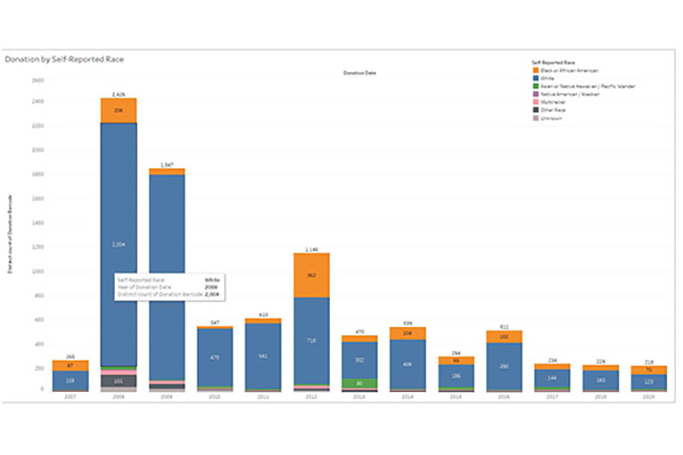
Women of differing races and ethnicities develop breast cancer differently. In addition, breast cancer treatments affect Black and Brown women differently than white women. It is important for researchers to study these differences, and that need determines what samples are requested from the KTB. Here is a Tableau graphic Jenny created that can help visualize the racial makeup of the women who donated tissue to the KTB in any given year.

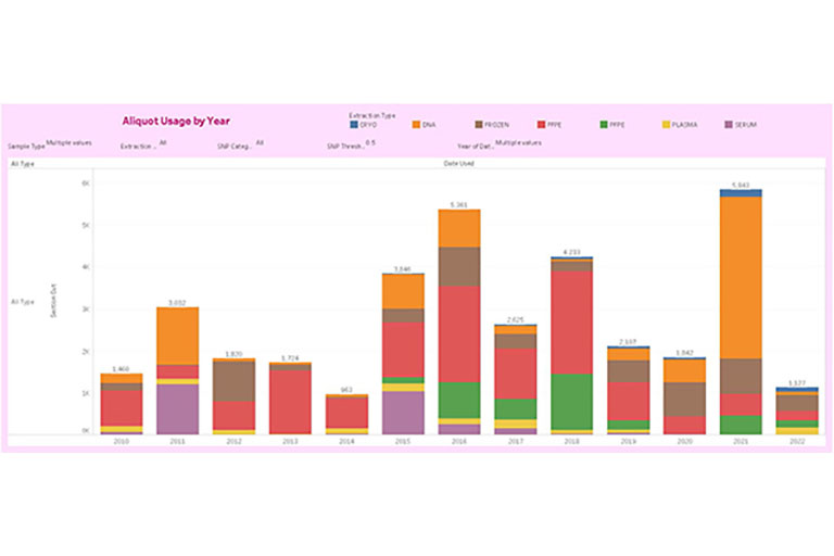
As researchers are requesting our samples and receiving them from us, it is crucial that we are able to keep track of the samples coming into, and going out of, the KTB storage spaces. This enables us to know which of our sample types might need replenishing. Here is a Tableau showing how many aliquots of our different types of samples were used in any given year.

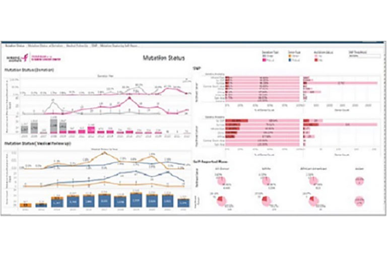
Other interesting Tableau graphics created by Jenny demonstrate the mutations carried by our KTB donors (such as BRCA 1, BRCA 2, or CHEK2) and the donors’ self-reported race as compared to the results of the genetic testing of their samples, which might tell a different story. Jenny and her dedication to increasing KTB data visualization have brought an entirely new understanding of our data and its importance.
